Sync - Re-designing Securian Financial's intranet
Date
September 2024
Service
Intranet
Company
Securian Financial
Overview
In the fall of 2023, I was recruited by a new product owner to help redesign SYNC, Securian Financial’s intranet. My role involved applying Digital Standards Guide (DSG) components, collaborating cross-functionally, and innovating features that could elevate the intranet experience. This redesign aimed to create a modern, accessible platform focusing on revamping the IA and search, creating content-based hubs, and designing custom components to meet the needs of the redesign.
Given a tight deadline of October 2024 (ahead of open enrollment), I led a phased approach to deliver the redesign, emphasizing cross-team alignment and user-centered design. Here’s how I approached the project from initial research through launch and planned future phases.
Laying the Groundwork: User Research and Stakeholder Engagement
Challenge
To make the redesign successful, we needed to understand the existing user experience and priorities of multiple departments contributing to SYNC content. At the same time, bringing stakeholders on board was essential to secure buy-in and reduce friction during the redesign process.
Solution
User research
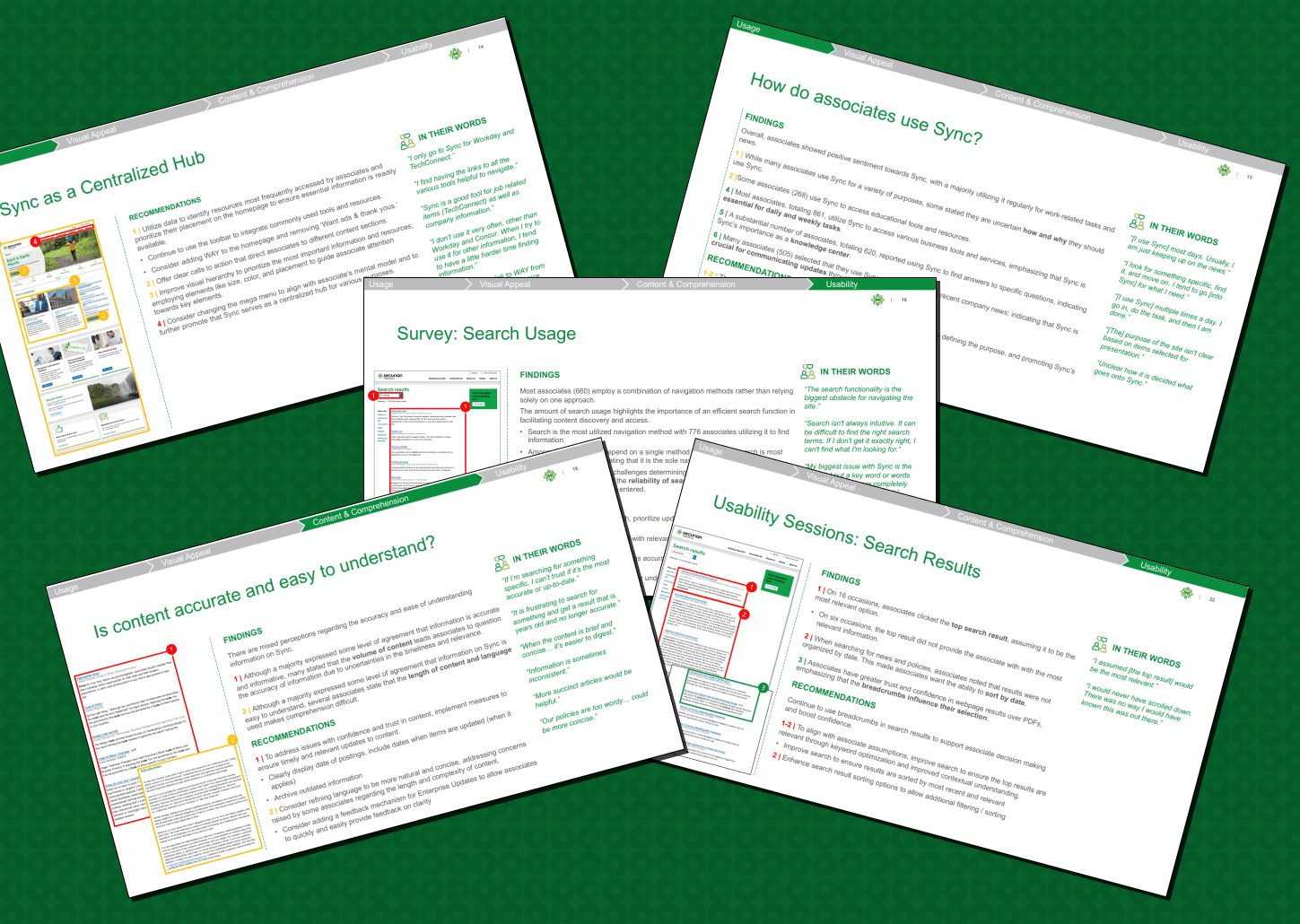
I recommended partnering with our user researcher to conduct user testing and interviews. We collected data on pain points and opportunities, gaining insights into user needs for navigation, search functionality, and content organization.
Competitive analysis
Every year, NN/G releases a report of the "best" intranets. This report includes features, design, team structure, platform, etc to help companies inform their own intranet design. We purchased this exhaustive (800+ page!) report to help guide our redesign effort.
Stakeholder workshops
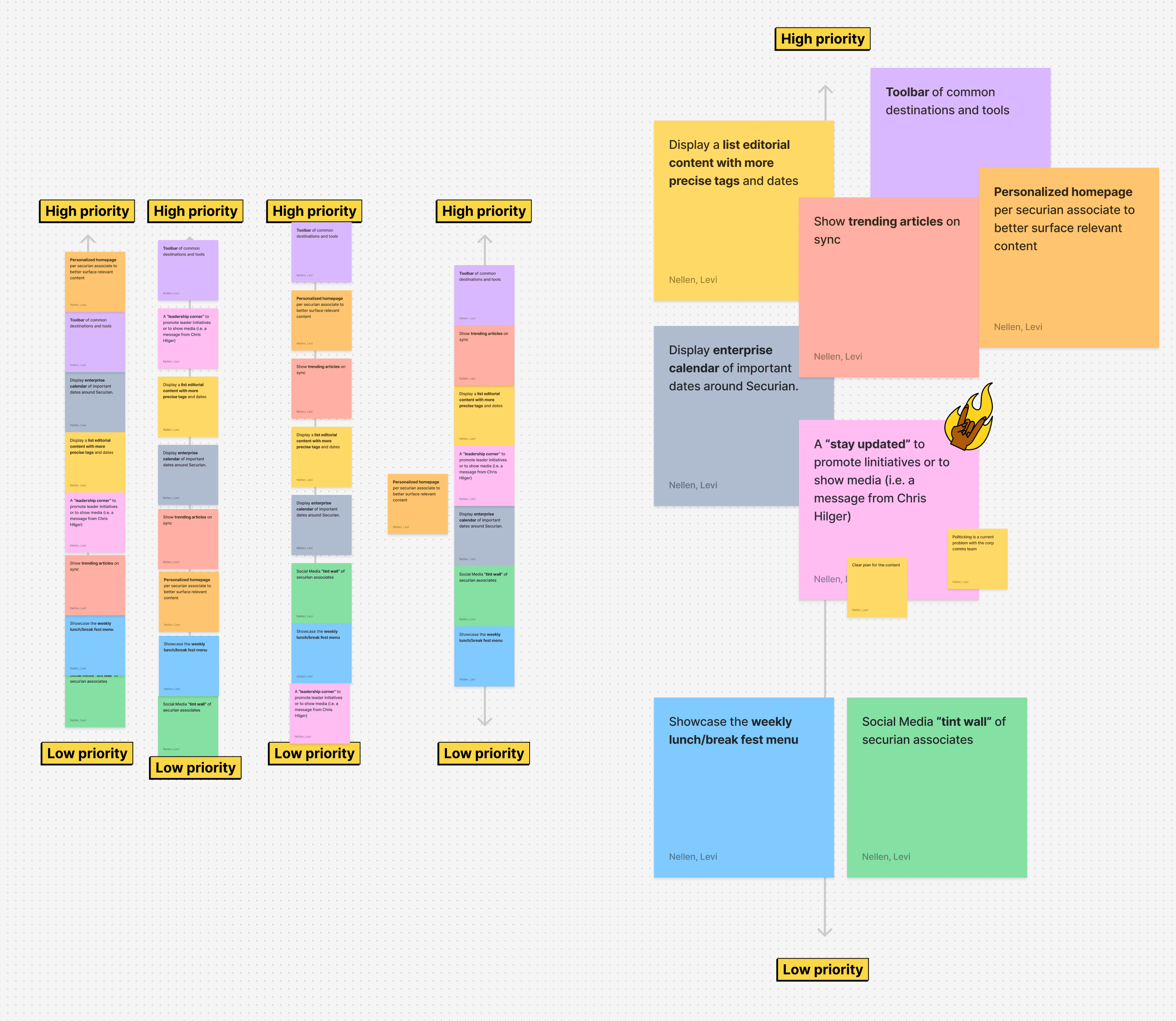
After gathering research, I led a workshop with department leads and content owners. I presented nine potential features and asked each participant to prioritize them. This process not only gave us clarity on cross-departmental needs but also fostered collaboration and buy-in.
What we found
Through our research, we discovered the following key take-aways that would drive our redesign effort:
Revamp Search and IA
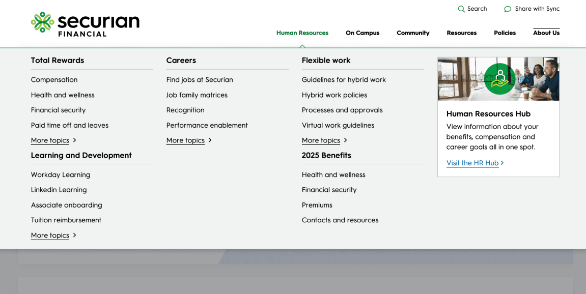
We found that many of our associates utilized search to navigate the intranet — a byproduct of a poor and disjointed IA from years of bloat. Our redesign would need to focus on reorganizing the site's navigation while introducing features to make search more accurate.
Showcase events and all-company gatherings
With RTO in full effect, and a further expansion of the policy in the future, we identified a need to have events and meetings highlighted on the platform. This would empower associates to tailor their in-office visits with meaningful activities around campus.
Create content-specific hubs
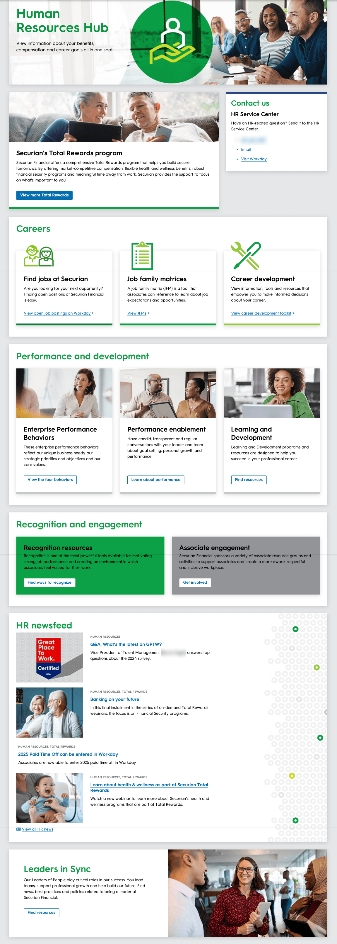
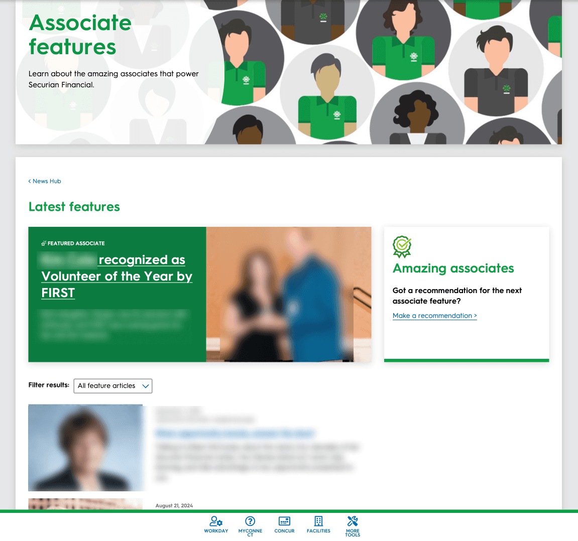
Much of the content on "old" sync was fractured and located all throughout the platform. Following a content audit and IA restructure after a session of tree-tests, we took inspiration from the NN/G report and developed two "hubs" to contain a large swath of content: HR Hub and News Hub.
Our UXR, Stephanie Murch, conducted an in-depth usability test to highlight weaknesses.
Stakeholder prioritization sessions ensured all teams felt included in the redesign.
Designing an intranet for everyone with everyone
Challenge
For many involved with the intranet redesign — executive leadership, marketing, HR, AEM authors, etc — the design process was new and unfamiliar. It was important to be deliberate and inclusive to ensure everyone felt responsible for the final output.
Solution
Low-fidelity mockups
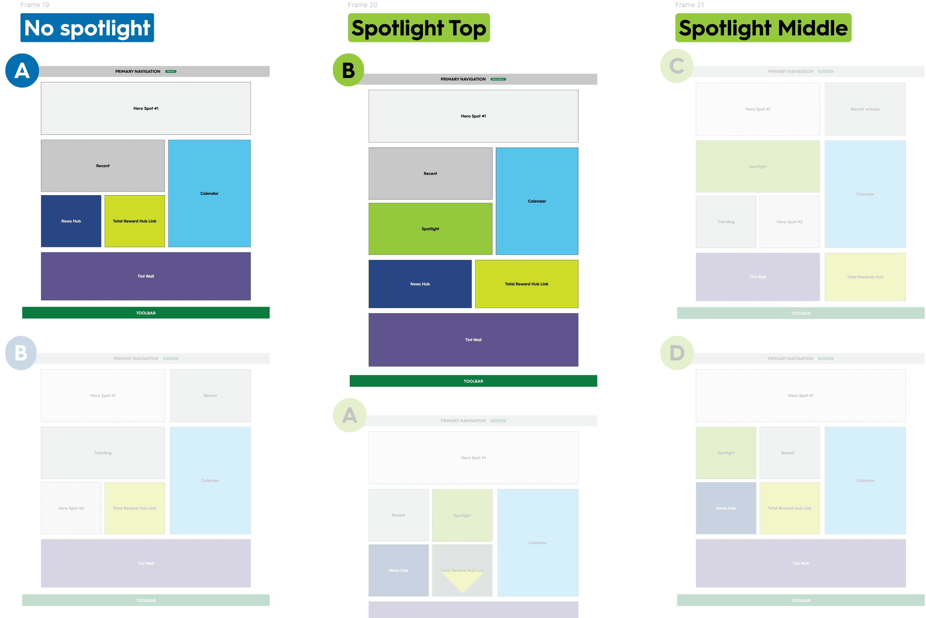
Low-fi mockups allowed the redesign team and other stakeholders to focus on the content and goals of the redesign effort without getting bogged-down in the details.
Consistent touchpoints and transparent design
It was important to have consistent check ins with the editorial team, HR team, and executive leadership team to ensure that our designs were hitting their goals while defending decisions that kept users' needs first.
Collaboration with engineering and content
As the primary UX Designer, I maintained ongoing communication with the engineers on the Design System Team and the content management team, ensuring they were aware of new elements that required coding in Adobe AEM. This early alignment minimized last-minute surprises and facilitated a smooth development process.
Low-fi prototyping is a powerful practice to include stakeholders in the design process.
Designing with DSG Components and Innovating New Features
Challenge
We needed to create a cohesive design experience that leveraged in-production components where possiblewhile allowing for innovation in key areas like search functionality and navigation.
Solution
Campus calendar
The campus calendar was an important and oft-requested feature of associates and leaders to showcase events happening around the Securian campus in St. Paul. This component was repurposed from an already in-production AEM component for expediency.
Spotlight CTA
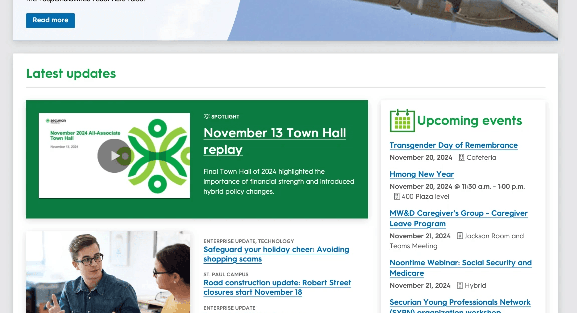
The Spotlight CTA was a new component to allow product teams to highlight content that needed more prominence on the page than what was afforded to them with current DSG components.
Sticky action toolbar
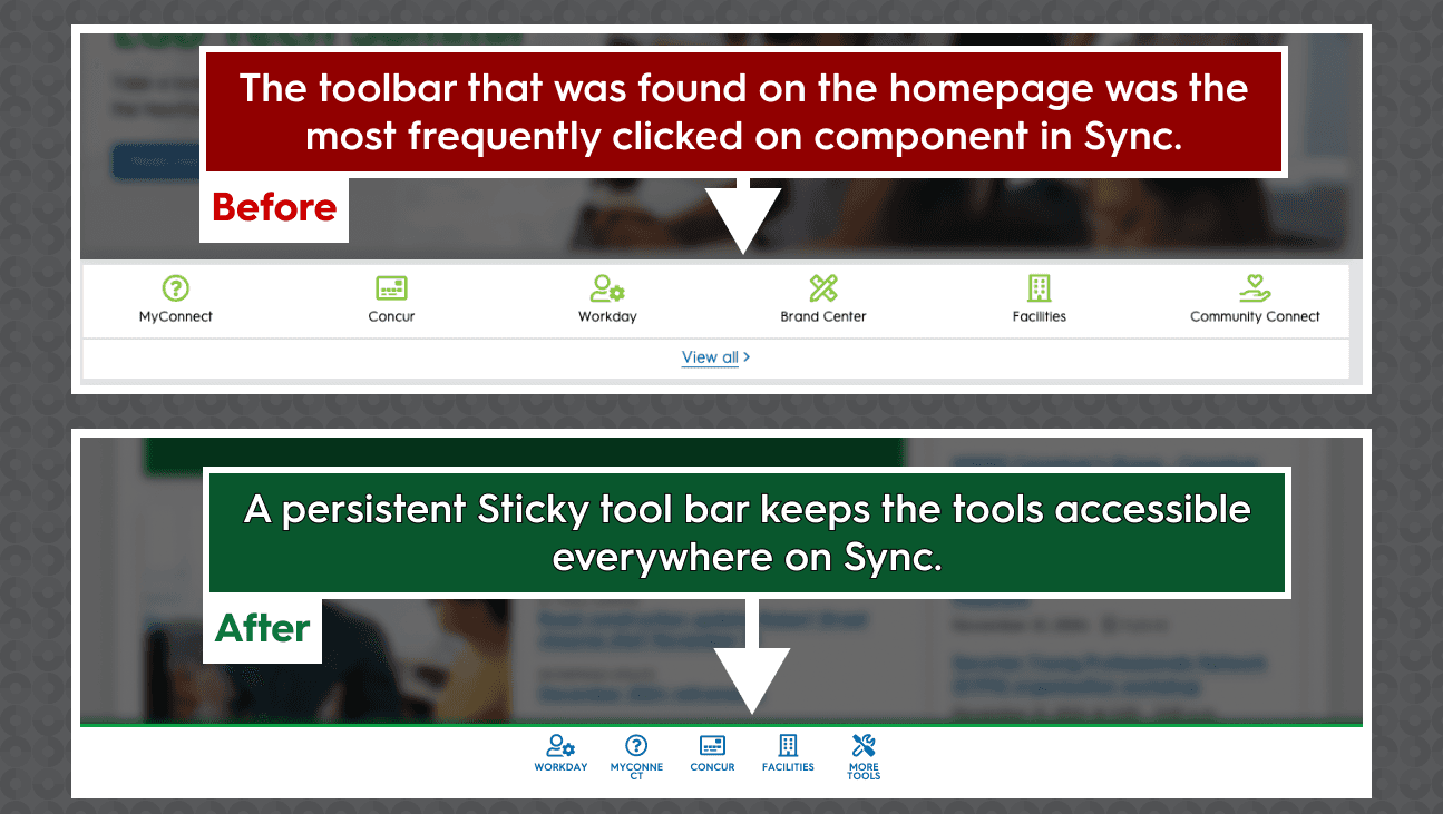
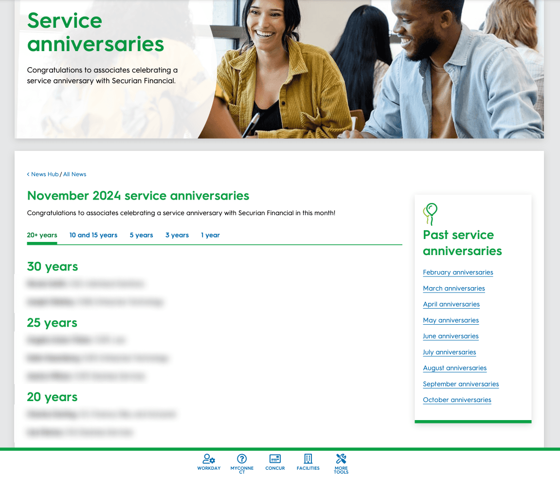
The toolbar, a collection of tools frequented by Securian associates, was previously only available on the home page. Moving the toolbar to a persistent sticky action bar allows associates to access the tools on any page on Sync.
The Spotlight CTA allows teams to highlight content in a more promiment fashion.
Turning the toolbar into a persistent sticky toolbar allows access to tools everywhere on Sync.
Enhancing Search Functionality and Usability Testing
Challenge
Improving search was a major focus, as the existing experience did not fully meet user needs. Additionally, given the timeline constraints, we needed to prioritize which search enhancements could realistically be implemented for the October release.
Solution
Filterable results
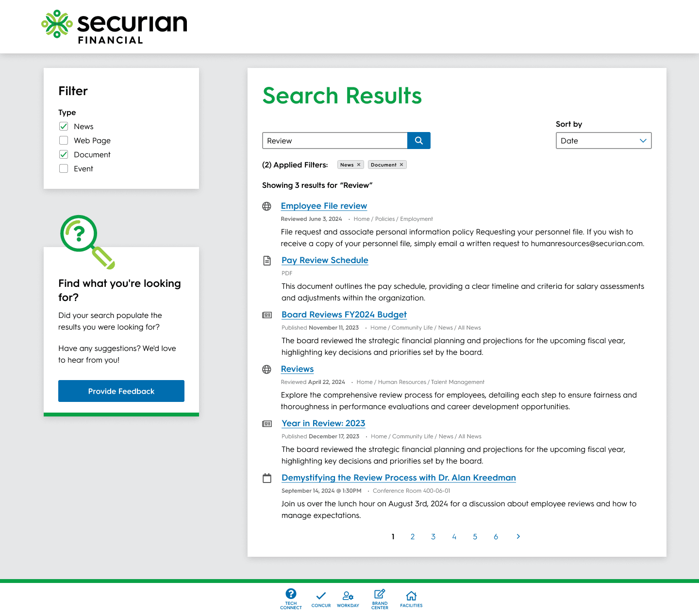
The search needed to be filtered by content type, not content category as it currently allowed. This would help users fine-tune what exactly they were searching for.
Recent and date showcase
Search results needed to both list the date of last edit or publication and sorted by recency. A common complaint from users was accessing old or outdated content (which was also remedied with a content audit and automatic-review workflows created in AEM).
Icons and sorting
To help users further identify the type of content they are accessing, icons were introduced to search terms alongside the ability to sort results based upon activated filters.
Filters, sorting, dates, and icons create a more impactful search for users.
Tracking Performance and Next Steps
We succeeded in releasing in our October window, and now are monitoring the performance of the first rollout of the redesign and then visiting the roadmap to plan future improvements to the intranet.
Metrics
Search queries
The restructured IA, news and HR hubs, and improvements to search will hopefully continue the initial downward trend we are seeing in search queries by users — a sign that our redesign effort is working. Current estimates point to around a 40-45% reduction in search queries.
Hub visits
After the IA restructure, we are analyzing the hub for user activity to ensure the placement of various elements is aligned with stakeholder goals.
Employee survey
We are going to share the same survey with employees about the intranet a few months post launch and compare the results with the initial survey. We expect to see substantial improvements, especially in relation to associates finding what they need.
Next Steps
Version 2 — What we couldn't get into version 1
With the deadline behind us, we are looking to continue our efforts with initiatives that were left on the cutting room floor, including a re-build calendar component, Microsoft Teams integration, and user groups.
Version 3 — Personalization
Once SSO is fully integrated with Sync, we can begin to leverage Workday API integrations to break users into teams and departments to deliver personal and content-specific content, further reinforcing Sync as a company and team hub.
Impact
The SYNC redesign project successfully transformed Securian Financial’s intranet, making it a more usable, accessible, and engaging platform for associates. By fostering collaboration, implementing user-centered design, and prioritizing strategic features, we created a scalable, modern intranet that meets the evolving needs of Securian’s employees.
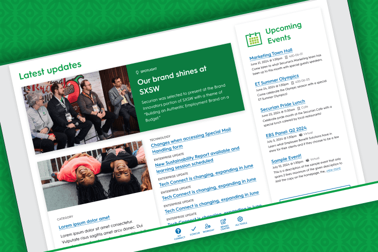
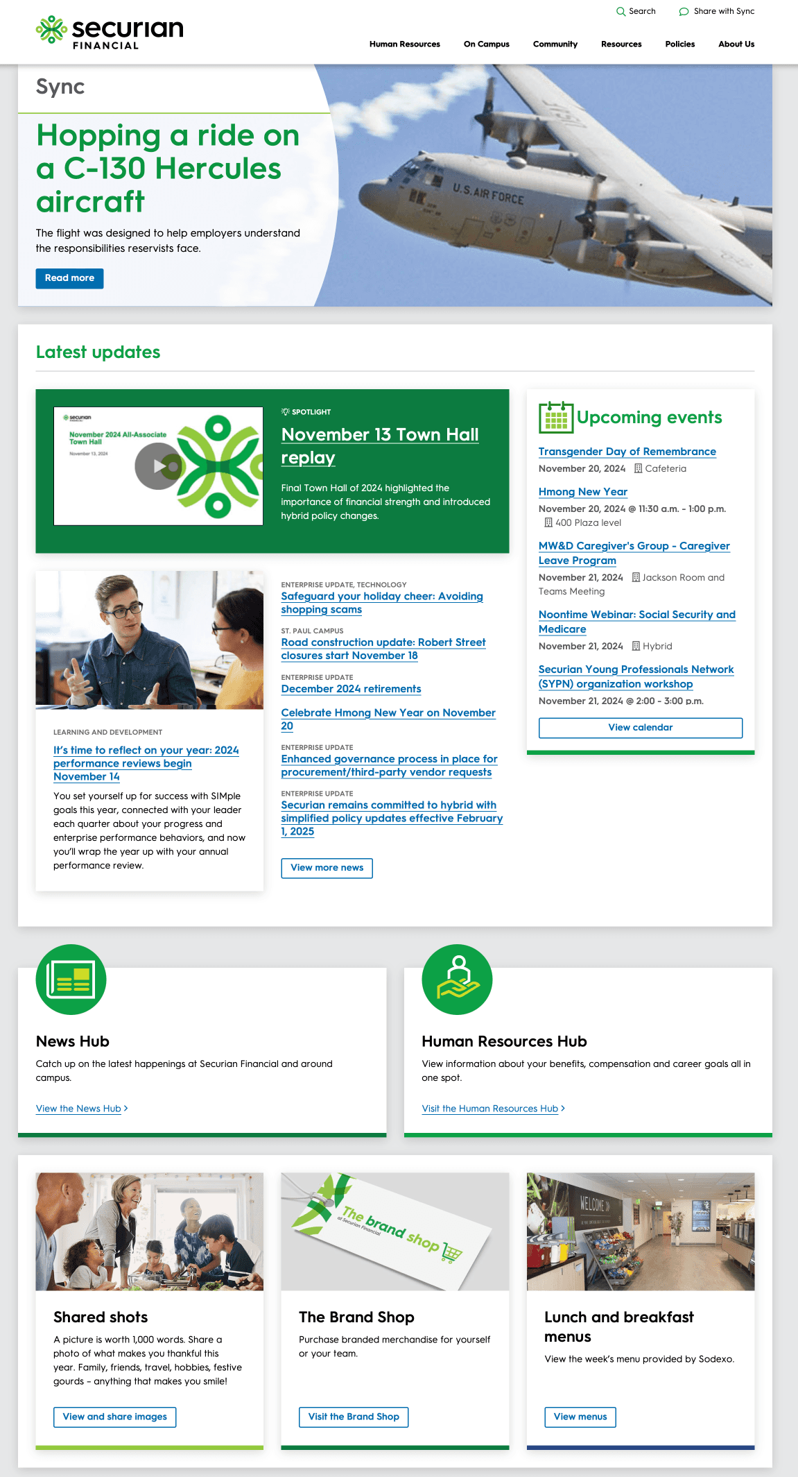
Screens from the Sync redesign.
