DSG - Design System - Transforming Usability and Accessibility in Securian Financial's Design System
Date
2022-2024
Service
Design system
Company
Securian Financial
Overview
As a UX Designer on the Digital Standards Guide (DSG) team at Securian Financial, I undertook a comprehensive project to modernize and improve our design system’s usability and accessibility. Securian’s design system, which spanned over a decade of contributions from various designers and engineers, had become a fragmented tool lacking consistency in usability, accessibility, and flexibility across components.
This effort focused on three key areas: enhancing form inputs, establishing a cohesive color scale, and standardizing focus states. This overhaul aimed to deliver an inclusive, accessible experience while aligning with brand standards and technical needs.
Enhancing Form Inputs for User-Focused Data Entry
Challenge
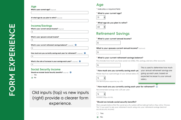
Form inputs are essential touchpoints in our digital products, central to user interactions like data entry and service sign-ups. However, when I joined, our input fields were limited in functionality and accessibility, often failing audits due to the overuse of tooltips and lack of clear, accessible guidance. This created a frustrating experience, especially for users with accessibility needs who relied on context clues and accessible navigation.
Solution
I redesigned our form components to provide clear, accessible guidance and streamlined interactions:
Contextual Description Text
I added description text between the label and input field to give context without overwhelming users with tooltips. This change improved readability, letting users understand field requirements at a glance.
Helper Text
Helper text below inputs provided formatting guidance, reducing errors and supporting accurate data entry.
Utility Icons and Clear Button
Icons such as validation indicators, error icons, and a clear button (long requested by product teams) were added to improve feedback and control within input fields.
Character Counter and Read-Only State
A character counter helped users manage input limits, and a read-only state improved clarity without implying unavailability, unlike traditional disabled states.
Mobile-Friendly Sizing
I standardized a 45-pixel tap target for mobile inputs, significantly improving usability on mobile devices in line with accessibility standards.
These changes were implemented across text inputs, text areas, and drop-downs, providing a consistent and intuitive experience. This update transformed our form interactions, meeting modern usability and accessibility standards while addressing long-standing pain points.
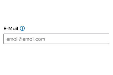
Our old inputs asked a lot of the user, increasing cognitive load.
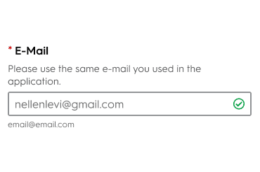
The new inputs included many usability features that empowered users to complete our forms.
Establishing a Modern Color Scale with Design Tokens
Challenge
As our design system aged, color usage became another area needing improvement. Our color scale was limited, and product teams were often constrained by the lack of flexible, accessible color choices. Updating the color palette required close collaboration with brand and engineering to ensure new colors met design goals without conflicting with established brand guidelines.
Solution
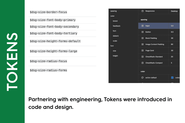
Working with engineers and brand, I developed a color token system that introduced a refreshed color scale while keeping brand-approved hues.
Collaboration with Engineering
I confirmed that color-based design tokens could be implemented across our system, laying the groundwork for scalability. This set the stage for future abstraction of other design decisions into tokens.
Defining a Focused Color Scale
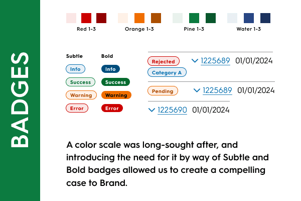
Instead of a traditional scale with multiple shades, we chose three values (10, 500, and 700) for each color—Pine (green), Water (blue), Red, and Orange—balancing brand requirements with flexibility.
Targeted Use Cases
Each color and variant served specific purposes, such as indicating warning and error states in notifications. The simplified scale also prevented potential misuse across siloed product teams.
Brand Approval and Documentation
After presenting our proposal to the brand team, we received approval for the new colors. Detailed documentation and usage guidelines ensured consistent, responsible use across the organization.
This color token system aligned our design system with modern standards, enabling scalable, accessible color usage and empowering product teams with enhanced visual tools.
Color scale to meet the needs of the evolving design system.
Standardizing Focus States for Accessibility and Consistency
Challenge
Due to the design system’s long history, focus states had become inconsistent across components, leading to accessibility issues for users who navigated with keyboards or screen readers. These inconsistencies, flagged repeatedly in audits, posed a significant usability barrier, as they affected the visual clarity of active elements.
Solution
Alongside the input updates, I took the opportunity to standardize focus states across all components and patterns.
Comprehensive Component Audit
I audited every component and pattern in our design system to identify and address inconsistencies.
Designing a Unified Focus Style
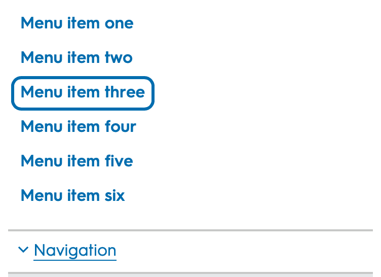
I developed several versions of a focus state that would be prominent across various colored backgrounds. We selected a high-contrast “sky blue” outline as the primary color, with white and black variants for optimal visibility on different backgrounds.
Testing and Team Feedback
Usability testing and feedback from the design system and UX teams guided final adjustments, ensuring the new focus states were easy to follow and provided a clear navigation path for all users.
System-Wide Implementation
We rolled out the new focus states in a major DSG update, bringing consistency to every interactive element in our system. This improvement addressed multiple accessibility audit points, meeting the needs of both assistive users and internal teams who had long awaited these changes.
This standardized focus state update delivered immediate accessibility improvements and solidified the design system’s foundation for an inclusive experience.
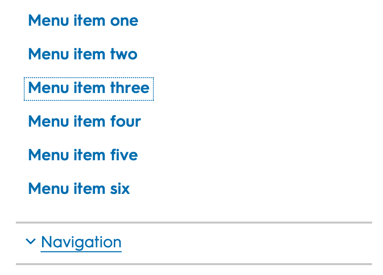
The focus states were hard to spot and lacked consistency.
A thicker, more standard approach to focus states helped meet a11y requirements
Impact
By establishing consistent, accessible components, we empowered product teams to deliver a cohesive, inclusive user experience, aligning our system with modern accessibility standards and brand guidelines. These enhancements addressed long-standing challenges, streamlining design and development processes and ensuring that our digital products serve all users effectively.
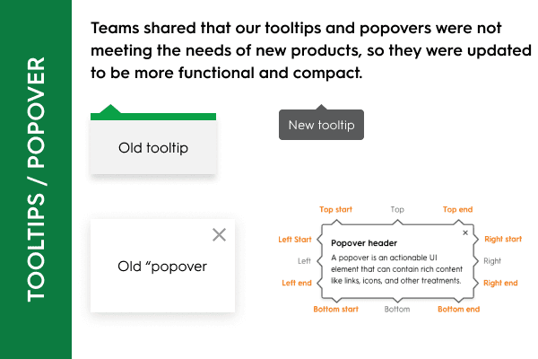
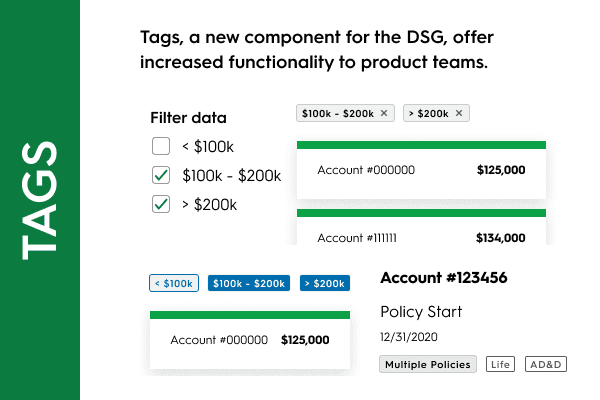
A collection of initiatives I championed during my time with the DSG team.
